Tuesday, June 29, 2010

GeneSifter Lab Edition 3.15

Last week we released GeneSifter Laboratory Edition (GSLE) 3.15.  From NGS quality control data, to improved microarray support, to Sanger sequencing support, to core lab branding, and many others, there are a host of features and improvements for everyone that continue to make GSLE the leading LIMS for genetic analysis.

The three big features include QC Analysis of Next Generation Sequencing (NGS) Data and Microarrays, and core lab branding support.
  • To better troubleshoot runs, and view data quality for individual samples in a multiplex, the data within fastq, fasta, or csfasta (and quality) files are used to generate quality report graphics (figure below). These include the overall base (color) composition, average, per base, quality values (QVs), box and whisker plots showing median, lower and upper quartile, and minimum and maximum QVs at each base position, and error analysis indicating the number of QVs below 10, 20 and 30. A link is also provided to conveniently view the sequence data in pages, so that GBs of data do not stream into your browser.
  • For microarray labs, quality information from CHP and CEL files and a probe intensity data from CEL files are displayed. Please contact support@geospiza.com to activate of Affymetrix Settings and configure the CDF file path and power tools. 
  • For labs that use their own ordering systems, a GSLE data view page has been created that can be embedded in a core lab website. To support end user access, a new user role, Data Viewer, has been created to limit access to only view folders and data within the user's lab group. Please contact support@geospiza.com to activate the feature.  
  • The ability to create html tables in the Welcome Message for the Home page has been returned to provide additional message formatting capabilities. 

Laboratory Operations
Several features and improvements introduced in 3.15 help prioritize steps, update items, improve ease of use, and enhance data handling.

Instrument Runs
  • A time/date stamp has been added to the Instrument Run Details page to simplify observing when runs were completed. 
  • Partial Sanger (CE) runs can be manually completed (like NGS runs) instead of having to have all reactions be complete or fail the remaining. 
  • The NGS directory view of result files now provides deletion actions (by privileged users) so labs can more easily manage disk usage. 
Sample Handling
  • Barcodes can be recycled or reused for templates that are archived to better support labs using multiple lots of 2D barcode tubes. However, the template barcode field remains unique for active templates. 
  • Run Ready Order Forms allow a default tag for the Plate Label to populate the auto-generated Instrument Run Name to make Sanger run set up quicker. 
  • The Upload Location Map action has been moved to the side menu bar under Lab Setup to ease navigation. 
  • The Template Workflows “Transition to the Next Workflow” action is now in English: “Enter Next Workflow.”
  • All Sanger chromatogram download options are easier to see and now include the option to download .phd formatted files. 
  • The DNA template location field can be used to search for a reaction in a plate when creating a reaction plate.
  • To redo a Sanger reaction with a different chemistry, the chemistry can now be changed when either Requeuing for Reacting is chosen, or Edit Reactions from within a Reaction Set is selected.
Orders and Invoices 
More efficient views and navigation have been implemented for Orders and Invoices.
  • When Orders are completed, the total number of samples and the number of results can be compared on the Update Order Status page to help identify repeated reactions. 
  • A left-hand navigation link has been added for core lab customers to review both Submitted and Complete Invoices. The link is only active when invoicing is turned on in the settings. 
System Management 
Several new system settings now enable GSLE to be more adaptable at customer sites.
  • The top header bar time zone display can be disabled or configured for a unique time zone to support labs with customers in different time zones. 
  • The User account profile can be configured to require certain fields. In addition, if Lab Group is not required, then Lab Groups are created automatically. 
  • Projects within GSLE can be inactivated by all user roles to hide data not being used. 
Application Programming Interface
Several additions to the self-documenting Application Programming Interface (API) have been made.
  • An upload option for Charge Codes within the Invoice feature was added.
  • Form API response objects are now more consistent.
  • API keys for user accounts can be generated in bulk.
  • Primers can be identified by either label or ID.
  • Events have been added. Events provide a mechanism to call scripts or send emails (beyond the current defaults) when system objects undergo workflow changes.  
Presently, API's can only be activated on local, on-site, installations. 

Friday, June 11, 2010

Levels of Quality

Next Generation Sequencing (NGS) data can produce more questions than answers. A recent LinkedIn discussion thread began with a simple question. “I would like to know how to obtain statistical analysis of data in a fastq file? number of High quality reads, "bad" reads....” This simple question opened a conversation about quality values, read mapping, and assembly. Obviously there is more to NGS data quality than simply separating bad reads from good ones.

Different levels of quality
Before we can understand data quality we need to understand what sequencing experiments measure and how the data are collected. In addition to sequencing genomes, many NGS experiments focus on measuring gene function and regulation by sequencing the fragments of DNA and RNA isolated and prepared in different ways. In these assays, complex laboratory procedures are followed to create specialized DNA libraries that are then sequenced in a massively parallel format.

Once the data are collected, they need to be analyzed in both common and specialized ways as defined by the particular application. The first step (primary analysis) converts image data, produced by different platforms into sequence data (reads). This step, specific to each sequencing platform, also produces a series of quality values (QVs), one value per base in a read, that define a probability that the base is correct. Next (secondary analysis), the reads and bases are aligned to known reference sequences, or, in the case of de novo sequencing, the data are assembled into contiguous units from which a consensus sequence is determined. The final steps (tertiary analysis) involve comparing alignments between samples or searching databases to get scientific meaning from the data. 

In each step of the analysis process, the data and information produced can be further analyzed to get multiple levels of quality information that reflect how well instruments performed, if processes worked, or whether samples were pure. We can group quality analyses into three general levels: QV analysis, sequence characteristics, and alignment information.

Quality Value Analysis
Many of the data quality control (QC) methods are derived from Sanger sequencing where QVs could be used to identify low quality regions that could indicate mixtures of molecules or define areas that should be removed before analysis. QV correlations with base composition could also be used to sort out systematic biases, like high GC content, that affect data quality. Unlike Sanger sequencing, where data in a trace represent an average of signals produced by ensemble of molecules, NGS provides single data points collected from individual molecules arrayed on a surface. NGS QV analysis uses counting statistics to summarize the individual values collected from the several million reads produced by each experiment.

Examples of useful counting statistics include measuring average QVs by base position, box and whisker (BW) plots, histogram plots of QV thresholds, and overall QV distributions. Average QVs by base, BW plots, and QV thresholds are used to see how QVs trend across the reads. In most cases, these plots show the general trend that data quality decreases toward the 3’ ends of reads. Average QVs by base show each base’s QV with error bars indicating the values that are within one standard deviation of the mean. BW plots provide additional detail to show the minimum and maximum QV, the median QV and the lower and upper quartile QV values for each base. Histogram plots of QV thresholds count the number of bases below threshold QVs (10, 20, 30). This methods provides information about potential errors in the data and its utility in applications like RNA-seq or genotyping. Finally distributions of all QVs or the average QV per read can give additional indications of dataset quality.

QV analysis primarily measures sequencing and instrument run quality. For example, sharp drop offs in average QVs can identify systematic issues related to the sequencing reactions. Comparing data between lanes or chambers within a flowcell can flag problems with reagent flow or imaging issues within the instrument. In more detailed analyses, the coordinate positions for each read can be used to reconstruct quality patterns for very small regions (tiles) within a slide to reveal subtle features about the instrument run.

Sequence Characteristics
In addition to QV analysis we can look the sequences of the reads to get additional information. If we simply count the numbers of A’s, C’s, G’s, or T’s (or color values), at each base position, we can observe sequence biases in our dataset. Adaptor sequences, for example, will show sharp spikes in the data, whereas random sequences will give us an even distribution, or bias that reflects the GC content of the organism being analyzed. Single stranded data will often show a separation of the individual base lines; double stranded coverage should have equal numbers of AT and GC bases.

We can also compare each read to the other reads in the dataset to estimate the overall randomness, or complexity, of our data. Depending on the application, a low complexity dataset, one with a high number of exactly matching reads, can indicate PCR biases or a large number of repeats in the case of de novo sequencing. In other cases, like tag profiling assays, which measure gene expression by sequencing a small fragment from each gene, low complexity data are normal because highly expressed genes will contribute a large number of identical sequences.

Alignment Information
Additional sample and data quality can be measured after secondary analysis. Once the reads are aligned (mapped) to reference data sources we can ask questions that reflect both run and sample quality. The overall number of reads that can be aligned to all sources can also be used to estimate parameters related to library preparation and deposition of the molecules on the beads or slides used for sequencing. Current NGS processes are based on probabilistic methods for separating DNA molecules. Illumina, SOLiD, and 454 all differ with respect to their separation methods, but share the common feature that the highest data yield occurs when concentration of DNA is just right. The number of mappable reads can measure this property.

DNA concentration measures one aspect of sample quality. Examining which reference sources reads align to gives further information. For example, the goal of transcriptome analysis is to sequence non-ribosomal RNA (rRNA). Unfortunately rRNA is the most abundant RNA in a cell. Hence transcriptome assays involve steps to remove rRNA and a large number of rRNA reads in the data indicates problems with the preparation. In exome sequencing or other methods where certain DNA fragments are enriched, the ratio of exon (enriched) and non-exon (non-enriched) alignments can reveal how well the purification worked.

Read mapping, however, is not a complete way to measure data quality. High quality reads that do not match any reference data in the analysis pipeline could be from unknown laboratory contaminants, sequences like novel viruses or phage, or incomplete reference data. Unfortunately, the former case is the more common, so it is a good idea to include reference data for all ongoing projects in the analysis pipeline. Alignments to adaptor sequences can reveal issues related to preparation processes and PCR, and the positions of alignments can be used to measure DNA or RNA fragment lengths.

So Many Questions
The above examples provide a short tour of how NGS data can be analyzed to measure the quality of samples, experiments, protocol and instrument performances. NGS assays are complex and involve multistep lab procedures and data analysis pipelines that are specific to different kinds of applications. Sequence bases and their quality values provide information about instrument runs and some insights into samples and preparation quality. Additional, information are obtained after the data are aligned to multiple reference data sources. Data quality analysis is most useful when values are computed shortly after data are collected, and systems, like GeneSifter Lab and Analysis Editions, that automate these analyses are important investments if labs plan to be successful with their NGS experiments.

Friday, May 21, 2010

I Want My FinchTV*

Without a doubt FinchTV is a wildly successful sequence trace viewer. Since it’s launch, close to 150,000 researchers and students have enjoyed its easy to use interface, cross platform capabilities, and unique features. But, where does it go from here? 

Time for Version 2

FinchTV is Geospiza's free DNA sequence trace viewer that is used on Macintosh, Windows, and Linux computers to open and view DNA sequence data from Sanger-based instruments. It reads both AB1 and SCF files and displays the DNA sequence and four color traces of the corresponding electropherogram. When quality values are present, they are displayed with the data. Files can be opened with a simple drag and drop action, and once opened, traces can be viewed in a either a single pane or multi-pane full sequence format. Sequences can be searched using regular expressions, edited, and regions selected and used to launch NCBI BLAST searches.

Over the past years we have learned that FinchTV is used in many kinds of environments suchas research labs, biotechnology and pharmaceutical companies, and educational settings. In some labs, it is the only tool people use to work with their data. We’ve also collected a large number of feature requests that include viewing protein translations, performing simple alignments, working with multiple sequences, changing the colors of the electropherogram tracings, and many others.

Free software is not built from free development 

FinchTV was originally developed under an SBIR grant as a prototype for cross platform software development. Until then, commercial quality trace viewers ran on either Windows or Macintosh, never both. Cross platform viewers were crippled versions of commercial programs, and none of the programs incorporated modern GUI (graphical user interface) features and were cumbersome to use.

FinchTV is a high quality, full featured, free program; we want to improve the current version and keep it free. So, the question becomes how to keep a free product up to date?

One way is through grant funding. Geospiza believes a strong case can be made to develop a new version of FinchTV under an SBIR grant because we know Sanger sequencing is still very active. From the press coverage, one would think next generation DNA sequencing (NGS) is going to be the way all sequencing will soon be done. True there are many projects where Sanger is no longer appropriate, but NGS cannot do small things, like confirm clones. Sanger sequencing also continues to grow in the classroom, hence tools like FinchTV are great as education resources. 

We think there are more uses too, so we’d like to hear your stories.

How do you use FinchTV?
What would you like FinchTV to do?

Send us a note (info at geospiza.com) or, even better, add a comment below. We plan to submit the proposal in early August and look forward to hearing your ideas.

* apologies to Dire Straights "Money for Nothing"

Monday, May 17, 2010

Journal Club: GeneSifter Aids Stem Cell Research

Last week’s Nature featured an article entitled “Aberrant silencing of imprinted genes on chromosome 12qF1 in mouse induced pluripotent stem cells [1]” in which GeneSifter Analysis Edition (GSAE) was used to compare gene expression between genetically identical mouse embryonic stem (ES) cells and induced pluripotent stem cells (iPSCs).

Stem Cells 

Stems cells are undifferentiated, pluripotent, cells that later develop into the specialized cells of tissues and organs. Pluripotent cells can divide essentially without limit, become any kind of cell, and have been found to naturally repair certain tissues. They are the focus of research because of their potential for treating diseases that damage tissues. Initially stem cells were isolated from embryonic tissues. However, with human cells, this approach is controversial. In 2006 researchers developed ways to “reprogram” somatic cells to become pluripotent cells [2]. In addition to being less controversial, iPSCs have other advantages, but there are open questions as to their therapeutic safety due to potential artifacts introduced during the reprogramming process. 

Reprogramming cells to become iPSCs involves the overexpression of a select set of transcription factors by viral transfection, DNA transformation, and other methods. To better understand what happens during reprogramming, researchers have examined gene expression and DNA methylation patterns between ES cells and iPSCs and have noted major differences in mRNA and microRNA expression as well as DNA methylation patterns. As noted in the paper, a problem with previous studies is that they compared cells with different genetic backgrounds. That is, the iPSCs harbor viral transgenes that are not present in the ES cells, and the observed differences could likely be due to factors unrelated to reprogramming. Thus, a goal of this paper's research was to compare genetically identical cells to pinpoint the exact mechanisms of reprogramming. 

GeneSifter in Action 

Comparing genetically similar cells requires that both ES cells and iPSCs have the same transgenes. To accomplish this goal, Stadtfeld and coworkers devised a clever strategy whereby they created a novel inducible transgene cassette and introduced it into mouse ES cells. The modified ES cells were then used to generate cloned mice containing the inducible gene cassette in all of their cells. Somatic cells could be converted to iPSCs by adding the appropriate inducing agents to the tissue culture media.
Even though ES cells and iPSCs were genetically identical, ES cells were able to generate live mice whereas iPSCs could not. To understand why, the team looked at gene expression using microarrays. The mRNA profiles for six iPSC and four ES cell replicates were analyzed in GeneSifter. Unsupervised clustering showed that global gene expression was similar for all cells. When the iPSC and ES cell data were compared using correlation analysis, the scatter plot identified two differentially expressed transcripts corresponding to a non-coding RNA (Gtl2) and small nucleolar RNA (Rian). The transcripts’ genes map to the imprinted Dlk1-Dio3 gene cluster on mouse chromosome 12qF1. While these genes were strongly repressed in iPSC clones, the expression of housekeeping and pluripotentency cells was unaffected as demonstrated using GeneSifter’s expression heat maps.

Subsequent experiments that looked at gene expression from over 60 iPSC lines produced from different types of cells and chimeric mice that were produced from mixtures of iPSCs and stem cells showed that the gene silenced iPSCs had limited development potential. Because the Dlk3-Dio cluster imprinting is regulated by methylation, methylation patterns revealed that the Gtl2 allele had acquired an aberrant silent state in the iPSC clones. Finally, by knowing that Dlk3-Dio cluster imprinting is also regulated by histone acetylation, the authors were able to treat their iPSCs with a histone deacetylase inhibitor and produce live animals from the iPSCs. Producing live animals from iPSCs in a significant milestone for the field.

While histone deacetylase inhibitors have multiple effects, and more work will need to be done, the authors have completed a tour de force of work in this exciting field, and we are thrilled that our software could assist in this important study. 

Further Reading

1. Stadtfeld M., Apostolou E., Akutsu H., Fukuda A., Follett P., Natesan S., Kono T., Shioda T., Hochedlinger K., 2010. "Aberrant silencing of imprinted genes on chromosome 12qF1 in mouse induced pluripotent stem cells." Nature 465, 175-181.

2. Takahashi K., Yamanaka S., 2006. "Induction of pluripotent stem cells from mouse embryonic and adult fibroblast cultures by defined factors." Cell 126, 663-676.

Tuesday, May 11, 2010

Journal Club: Decoding Biology

DNA sequences hold the information needed to create proteins and regulate their abundance. Genomics research focuses on deciphering the codes that control these processes by combining DNA sequences with data form assays that measure gene expression and protein interactions. The codes are deciphered when specific sequence elements (motifs) are identified and can be later used to predict outcomes. The recent Nature article “Deciphering the Splicing Code,” begins to reveal the codes of alternative splicing.

The genetic codes 

Since the discovery that DNA is a duplex molecule [1] which stores and replicates the information of living systems, the goal of modern biology has been to understand how the blueprint of a living system is encoded in its DNA. The first quest was to learn how DNA's four letter nucleotide code was translated into the 20 letter amino acid code of proteins. Experiments conducted in the 1960’s revealed that different combinations of triplet DNA bases encoded specific amino acids to produce the “universal” genetic code, which is nearly identical in all species that have been examined to date [2].

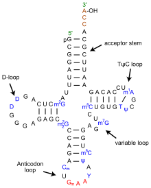
Translating mRNA into protein is a complex process, however, that involves many proteins and ribosomal RNA (rRNA) collectively organized in ribosomes. As the ribosomes read the mRNA sequence, transfer RNA (tRNA) molecules bring individual amino acids to the ribosome where they are added to a growing polypeptide chain. The universal genetic code explained how tri-nucleotide sequences specified amino acids. It could also be used to elucidate the anti-codon portion of tRNA [3], but it could not explain how the correct amino acid was added to the tRNA. For that another genetic code needed to be cracked. In this code, first proposed in 1988 [4], multiple sequences, including the anti-codon loop, within each tRNA molecule are recognized by a matched enzyme that combines an amino acid with its appropriate tRNA.

Codes to create diversity

The above codes are involved with the process of translating genetic sequences into protein. Most eukaryotic genes, and a few prokaryotic genes, cannot be translated in a continuous way because the protein coding regions (exons) are interrupted by non-coding regions (introns). When DNA is first transcribed into RNA, all regions are included and the introns must be excised to form the final messenger RNA (mRNA). This process makes it possible to create many different proteins from a single gene through alternative splicing in which exons are either differentially removed or portions of exons are joined together. Alternative splicing occurs in development and tissue specific ways; many disease causing mutations disrupt splicing patterns. So, understanding the codes that control splicing is an important research topic.

Some of the splicing codes, such as the exon boundaries, are well known, and others are not. In “Deciphering the Splicing Code,” Barash and colleagues looked at thousands of alternatively spliced exons - and surrounding intron sequences - from 27 mouse tissues to unravel over 1000 sequence features that could define a new genetic code. Their goal is build catalogs of motifs that could be used to predict splicing patterns of uncharacterized exons and determine how mutations might affect splicing.

Using data from existing microarray experiments, RNA sequence features compiled from the literature, and other known attributes of RNA structure, Barash and co-workers developed computer models to determine which combinations of features best correlated with experimental observations. The resulting computer program provided tissue specific splicing predictions of whether an exon would be included or excluded based on its surrounding motif sequences and tissue type with reasonable success. More importantly, the program could be used to identify interaction networks that identified pairs of motifs that were frequently observed together. 

Predicting alternative splicing is at an early stage, but as pointed out be the editorial summary, the approach of Barash and co-workers will be improved by the massive amounts of data being generated by new sequencing technologies and applications like RNA-Seq and various protein binding assays. The real test will be expanding the models to new tissues and human genomics. In the meantime, if you want to test their models on some of your data or explore new regulatory elements, the Frey lab has developed a web tool that can be accessed at http://genes.toronto.edu/wasp/.

I’m done with seconds, can I have a third? 

As an aside, the authors of the editorial summary coined the work as the second genetic code. I find this amusing, because this would be the third second genetic code. The aminoacyl tRNA code was also coined the second genetic code, but people must have forgotten that, because another second genetic code was proposed in 2001. This genetic code describes how methylated DNA sequences regulate chromatin structure and gene regulation. Rather than have a third second genetic code, maybe we should refer to this as the third genetic code or the next generation code.

Further Reading


1. Watson JD, and Crick F (1953). "A structure for deoxyribose nucleic acid". Nature 171: 737–8.

2. http://en.wikipedia.org/wiki/Genetic_code

3. http://nobelprize.org/nobel_prizes/medicine/laureates/1968/holley-lecture.pdf

4. Hou YM, Schimmel P (1988) "A simple structural feature is a major determinant of the identity of a transfer RNA." Nature 333:140-5.

Thursday, April 22, 2010

Bloginar: RNA Deep Sequencing: Beyond Proof of Concept

RNA-Seq is a powerful method for measuring gene expression because you can use the deep sequence data to measure transcript abundance and also determine how transcripts are spliced and whether alleles of genes are expressed differentially.  

At this year’s ABRF (Association for Biomedical Research Facilities) conference, we presented a poster, using data from published study, to demonstrate how GeneSifter Analysis Edition (GSAE) can be used in next generation DNA sequencing (NGS) assays that seek to compare gene expression and alternative splicing between different tissues, conditions, or species.

The following map guides the presentation. The poster has a title and four main sections, which cover background information, introduction to the published work and data, ways to observe alternative splicing and global gene expression differences between samples, and ways to observe sex specific gene expression differences. The last section also identifies a mistake made by the authors.  


Section 1. The first section begins with the abstract and lists five specific challenges created by NGS: 1) high end computing infrastructures are needed to work with NGS data, 2) NGS data analysis involves complex multistep processes, 3) NGS data need to be compared to many reference databases, 4) the resulting datasets of alignments must be visualized in different ways, and 5) scientific knowledge is gained when several aligned datasets are compared. 

Next, we are reminded that NGS data are analyzed in three phases: primary analysis, secondary analysis and tertiary analysis. Primary analysis is the step that converts images to reads consisting of basecalls (or colors, or flowgrams), and quality values. In secondary analysis, reads are aligned to reference data (mapped) or amongst themselves (assembled). Secondary analysis produces tables of alignments that must be compared to one and other, in tertiary analysis, to gain scientific insights. 

Finally, GSAE is introduced as a platform for scalable data analysis. GSAE’s key features and advantages are listed along with several screen shots to show the many ways in which analyzed data can be presented to gain scientific insights.  

Section 2 introduces the RNA-Seq data used for the presentation. These data, from a study that set out to measure sex and lineage specific alternative splicing in primates [1], were obtained from the Gene Expression Omnibus (GEO) database at NCBI, transferred into GSAE, and processed through GSAE’s RNA-Seq analysis pipelines.  We chose this study because it models a proper expression analysis using replicated samples to compare different cases.

All steps of the process, from loading the data to processing the files and viewing results were executed through GSAE’s web-based interfaces. The four general steps of the process are outlined in the box labeled “Steps.” 

The section ends with screen shots from GSAE showing how the primary data can be viewed and a list of the reports showing different alignment results for each sample in the list. The reports are accessed from a “Navigation Panel” that contains links to Alignment Summaries, a Filter Report, and a Searchable Sortable Gene List (shown), and several other reports (not shown). 

The Alignment Summary provides information about the numbers of reads mapping to different reference data sources that are used in the analysis to understand sample quality and study biology. For example, in RNA-Seq, it is important to measure and filter reads matching ribosomal RNA (rRNA) because the amount of rRNA present indicates how well clean up procedures work. Similarly, the number of reads matching adaptors indicates how well the library was prepared. Biological, or discovery based, filters include reads matching novel exon junctions and intergenic regions of the genome.

Other reports like the Filter Report and Gene List provide additional detail. The Filter Report clusters alignments and plots base coverage (read density) across genomic regions. Some regions, like mitochondrial DNA, and rRNA genes, or transcripts, are annotated. Others are not. These regions can be used to identify areas of novel transcription activity.

The Gene List provides the most detail and gives a comprehensive overview of the number of reads matching a gene, numbers of normalized reads, and the counts of novel splices, single nucleotide variants (SNVs), and small insertions and deletions (indels). Read densities are plotted as small graphs to reveal each gene’s exon/intron structure. Additional columns provide the gene’s name, chromosome, and contain links to further details in Entrez. The graphs are linked to the Integrated Gene Viewer to explore the data further. Finally, the Gene LIst is an interactive report that can searched, sorted, and filtered in different ways, so you can easily view the details of your gene or chromosome of interest.

Section 3 shows how GSAE can be used to measure global gene expression and examine the details for a gene that is differentially expressed between samples. In the case of RNA-Seq, or exon arrays, relative exon levels can be measured to observe genes that are spliced differently between samples. The presented example focuses on the arginosuccinate synthetase 1 (ASS1) gene and compares the expression levels of its transcripts and exons between the six replicated human and primate male samples.

The Gene Summary report shows that ASS1 is down regulated by 1.38 times in the human samples. More interestingly, the exon usage plot shows that this gene is differentially spliced between the species. Read alignment data, supporting this observation, are viewed by clicking the “View Exon Data” link that is below the Exon Usage heat map. This link brings up the Integrated Gene Viewer (IGV) for all six samples. In addition to showing read densities across the gene, IGV also shows the numbers of reads that span exon junctions as loops with heights proportional to the number of reads mapping to a given junction. In these plots we see that the human samples are missing the second exon whereas the primate samples show two forms of the transcript. IGV also includes the Entrez annotations and known isoforms for the gene and the positions of known SNPs from dbSNP.  And, IGV is interactive; controls at the top of the report and regions within the gene map windows are used to navigate to new locations and zoom in or out of the data presented.  When multiple genes are compared, the data are updated for all genes simultaneously. 

Section 3 closes with heat map representing global gene expression for the samples being compared. Expression data are clustered using a 2-way ANOVA with 5% false discovery filter (FDR). The top half of the hierarchical cluster groups genes that are down regulated in humans and up regulated in primates and the bottom half groups genes that are expressed in the opposite fashion. The differentially expressed genes can also be viewed in Pathway Reports which show how many genes are up or down regulated in a particular Gene Ontology (GO) pathway.  Links in these reports navigate to lists of the individual genes or their KEGG pathways.  When a KEGG pathway is displayed, the genes that are differentially expressed are highlighted.
Section 4 focuses on the sex specific differences in gene expression between the human and primate samples. In this example, 12 samples are being compared: three replicates for the male and female samples of two species. When these data were reanalyzed in GSAE, we were able to note that an obvious mistake. By examining Y chromosome gene expression, it was clear that one of the human male samples (M2-2) was lacking expression of these genes. Similarly, when the X (inactive)-specific transcript (XIST) was examined, M2-2 showed high expression like the other female samples. The simplest explanations for these observations are that either M2-2 is a female, or a dataset was copied and mislabeled in GEO. However, given that the 12 datasets show subtle differences, it is likely that they are all different and the first explanation is more likely. 

The poster closes with a sidebar showing how GSAE can be used to measure global sequence variation and the take home points for the presentation. The most significant being that if the authors of the paper had used a system like GSAE, they could have quickly observed the problems in their data that we saw and prevented a mistake. 

To see how you can use GSAE for your data sign up for a trial. 

1. Sex-specific and lineage-specific alternative splicing in primates. Blekhman R, Marioni JC, Zumbo P, Stephens M, Gilad Y,. Genome Res. published online December 15, 2009

Thursday, April 15, 2010

This blog has moved


This blog is now located at http://finchtalk.geospiza.com/.
You will be automatically redirected in 30 seconds, or you may click here.

For feed subscribers, please update your feed subscriptions to
http://finchtalk.geospiza.com/feeds/posts/default.

Tuesday, April 13, 2010

Bloginar: Standardizing Bioinformatics with BioHDF (HDF5)

Yesterday we (The HDF Group and Geospiza) released the BioHDF prototype software.  To mark the occasion, and demonstrate some of BioHDF’s capabilities and advantages, I share the poster we presented at this year’s AGBT (Advances in Genome Biology and Technology) conference.

The following map guides the presentation. The poster has a title and four main sections, which cover background information, specific aspects of the general Next Generation Sequencing (NGS) workflow, and HDF5’s advantages for working with large amounts of NGS data.
 
Section 1.  The first section introduces HDF5 (Hierarchical Data Format) as a software platform for working with scientific data.  The introduction begins with the abstract and lists five specific challenges created by NGS: 1) high end computing infrastructures are needed to work with NGS data, 2) NGS data analysis involves complex multi-step processes that, 3) compare NGS data to multiple reference sequence databases, 4) the resulting datasets of alignments must be visualized in multiple ways, and 5) scientific knowledge is gained when many datasets are compared. 

Next, choices for managing NGS data are compared in a four category table.  These include text and binary formats. While text formats (delimited and XML) have been popular for bioinformatics, they do not scale well and binary formats are gaining in popularity. The current bioinformatics binary formats are listed (bottom left) along with a description of their limitations. 

The introduction closes with a description of HDF5 and its advantages for supporting NGS data management and analysis. Specifically, HDF5 is platform for managing scientific data. Such data are typically complex and consist of images, large multi-dimensional arrays, and meta data. HDF5 has been used for over 20 years in other data intensive fields; it is robust, portable, and tuned for high performance computing. Thus HDF5 is well suited for NGS. Indeed, groups from academic researchers to NGS instrument vendors, and software companies are recognizing the value of HDF5.
Section 2. This section illustrates how HDF5 facilitates primary data analysis. First we are reminded that NGS data are analyzed in three phases: primary analysis, secondary analysis and tertiary analysis. Primary analysis is the step that converts images to reads consisting of basecalls (or colors, or flowgrams), and quality values. In secondary analysis, reads are aligned to reference data (mapped) or amongst themselves (assembled). In many NGS assays, secondary analysis produces tables of alignments that must be compared to one and other, in tertiary analysis, to gain scientific insights. 

The remaining portion of section 2 shows how Illumina GA and SOLiD primary data (reads and quality values) can be stored in BioHDF and later reviewed using the BioHDF tools and scripts.  The resulting quality graphs are organized into three groups (left to right) to show base composition plots, quality value (QV) distribution graphs, and other summaries.

Base composition plots show the count of each base (or color) that occurs at a given position in the read. These plots are used to assess overall randomness of a library and observe systematic nucleotide incorporation errors or biases.

Quality value plots show the distribution of QVs at each base position within the ensemble of reads. As each NGS run produces many millions of reads, it is worthwhile summarizing QVs in multiple ways. The first plots, from the top, show the average QV per base with error bars indicating QVs that are within one standard deviation of the mean. Next, box and whisker plots show the overall quality distribution (median, lower and upper quartile, minimum and maximum values) at each position. These plots are followed by “error” plots which show the total count of QVs below certain thresholds (red, QV < 10; green QV < 20; blue, QV < 30). The final two sets of plots show the number of QVs at each position for all observed values and the number of bases having each quality value.

The final group of plots show overall dataset complexity, GC content (base space only), average QV/read, and %GC vs average QV (base space only).  Dataset complexity is computed by determining the number of times a given read exactly matches other reads in the dataset. In some experiments, too many identical reads indicates a problem like PCR bias. In other cases, like tag profiling, many identical reads are expected from highly expressed genes. Errors in the data can artificially increase complexity.
Section 3.  Primary data analysis gives us a picture of how well the samples were prepared or how well the instrument ran with some indication about sample quality. Secondary and tertiary analysis tell us about sample quality and more importantly, provides biological insights. The third section focuses on secondary and tertiary analysis and begins with a brief cartoon showing a high level data analysis workflow using BioHDF to store primary data, alignment results, and annotations. BioHDF tools are used to query these data and other software within GeneSifter is used to compare data between samples and display the data in interactive reports to examine the details from single or multiple samples.

The left side of this section illustrates what is possible with single samples. Beginning with a simple table that indicates how many reads align to each reference sequence, we can drill into multiple reports that provide increasing detail about the alignments. For example, the gene list report (second from top) uses gene model annotations to summarize the alignments for all genes identified in the dataset. Each gene is displayed as a thumbnail graphic that can be clicked to see greater detail, which is shown in the third plot. The Integrated Gene View not only shows the density of reads across the gene's genomic region, but also shows evidence of splice junctions, and identified single base differences (SNVs) and small insertions and deletions (indels). Navigation controls provide ways to zoom into and out of the current view of data, and move to new locations. Additionally, when possible, the read density plot is accompanied by an Entrez gene model and dbSNP data so that data can be observed in a context of known information. Tables that describe the observed variants follow. Clicking on a variant drills into the alignment viewer to show the reads encompassing the point of variation.

The right side illustrates multi-sample analysis in GeneSifter. In assays like RNA-Seq, alignment tables are converted to gene expression values that can be compared between samples. Volcano (top) and other plots are used visualize the differences between the datasets. Since each point in the volcano plot represents the difference in expression for a gene between two samples (or conditions), we can click on that point to view the expression details for that gene (middle) in the different samples. In the case of RNA-Seq, we can also obtain expression values for the individual exons with the gene, making it possible to observe differential exon levels in conjunction with overall gene expression levels (middle). Clicking the appropriate link in the exon expression bar graph, takes us to the alignment details for the samples being analyzed (bottom), in this example we have two cases and two control replicates. Like the single sample Integrated Gene Views, annotations are displayed with alignment data. When navigation buttons are clicked all of the displayed genes move together so that you can explore the gene's details and surrounding neighborhood for multiple samples in a comparative fashion.
Section 4.  The poster closes with details about BioHDF.  First, the data model is described. An advantage of the BioHDF model is that read data are organized non-redundantly. Other formats, like BAM, tend to store reads with alignments and if a read has multiple alignments in a genome, or is aligned to multiple reference sequences, it gets stored multiple times. This may seem trivial, but anything that can happen a million times, becomes noticeable. This fact is demonstrated in the in table listed in the second panel “High Performance Computing Advantages.”  Other HDF5 advantages are listed below the performance stats table.  Most notably is HDF5’s ability to easily support multiple indexing schemes like nested containment lists (NClists). NClists solve the problem of efficiently accessing reads from alignments that may be contained in other alignments, which I will save for a later post.

Finally, the poster is summarized with a number of take home points. These reiterate the fact that NGS is driving the need to use binary file formats to manage NGS and analysis results and that HDF5 provides an attractive solution because of its long history and development efforts that specifically target scientific programming requirements. In our hands, HDF5 has helped make GeneSifter a highly scalable and interactive web-application with less development effort than would have been needed to implement other technologies.  

If you are software developer and are interested in BioHDF please visit www.biohdf.org.  If you do not want to program and instead, want a way to easily analyze your NGS data to make new discoveries, please contact us. 

Friday, March 19, 2010

RNA Deep Sequencing - Beyond Proof of Concept

ABRF 2010 begins this weekend.  In addition to my LIMS presentation on Sunday, I will present our poster featuring data analysis of sequences from "Sex-specific and lineage-specific alternative splicing in primates" (Blekhman et. al) in GeneSifter Analysis Edition.

The poster number is RP-3. Stop by and see how we learned that not all samples are what they seem to be ...

Abstract 

Next Generation DNA Sequencing (NGS) technologies are powerful tools for rapidly sequencing genomes and studying functional genomics. Presently, the value of NGS technology has been largely demonstrated on individual sample analyses (1-3). The full potential of NGS will be realized when it can be used in multisample experiments that involve different measurements and include replicates, and controls to make valid statistical comparisons. Arguably, improvements in current technology, and soon to be available “third” generation systems, will make it possible to simultaneously measure 100’s to1000’s of individual samples in single experiments to study transcription, alternative splicing, and how sequences vary between individuals and within expressed genes. However, several bioinformatics systems challenges must be overcome to effectively manage both the volumes of data being produced and the complexity of processing the numerous datasets that will be generated.

In this poster we present a system that is used it to verify and further characterize previously published data from a gene expression study that includes both replicates and experimental values comparing sex and lineage specific alternative splicing in primates (4). This system, developed on a high performance computing architecture, stores and organizes the data, aligns millions of reads to different reference sequences, identifies and removes artifacts, executes comparative and statistical analyses, and finally links results to pathway and ontological information for making discoveries and confirming hypotheses. The supporting infrastructure includes intuitive user interfaces for organizing data, executing analytical operations, viewing summarized reports, navigating through details in the results and can be easily operated by biologists.

1. Marioni JC, et. al. (2008) Genome Res.

2. Ramsköld D, et. al. (2009) PLoS Comput Biol.

3. Pleasance ED, et. al.(2010) Nature.

4. Blekhman R, et. al. (2009) Genome Res.

Sunday, March 14, 2010

Keeping Your DNA Sequencing, Genotyping, and Microarray Laboratory Competitive in a New Era of Genomics

ABRF 2010 is next week. The conference will be in sunny Sacramento CA. About 1000 technology geeks will convene to learn about the latest advances in DNA sequencing, genotyping, and proteomics instrumentation, lab protocols, and core lab services. We will be there with our booth and participate with LIMS and NGS data analysis presentations.

The first presentation, entitled "Keeping Your DNA Sequencing, Genotyping, and Microarray Laboratory Competitive in a New Era of Genomics," will be on Sunday Mar. 20 in the second concurrent workshop (w2) at 1:00 pm.

Abstract

Laboratory directors are facing enormous challenges with respect to keeping their laboratories competitive and retaining customers in the face of shrinking budgets and rapidly changing technology. A well-designed Laboratory Information Management System (LIMS) can help meet these challenges and manage costs as the scale and complexity of data collection and related services increase. LIMS can also offer competitive advantages through increased automation and improved customer experiences.

Implementing a LIMS strategy that will reduce data collection costs while improving competitiveness is a daunting proposition. LIMS are computerized data and information tracking systems that are highly variable with respect to their purpose, customization capabilities, and overall acquisition (initial purchase) and ownership (maintenance) costs. A simple LIMS can be built from a small number of spread sheets and track a few specific processes. Sophisticated LIMS rely on databases to manage multiple laboratory processes, capture and analyze different kinds of data, and provide decision support capabilities.

In this presentation, I will share 20 years of academic and industrial LIMS experiences and perspectives that have been informed through 100’s of interactions with core, research, and manufacturing laboratories engaged in DNA sequencing, genotyping, and microarrays. We’ll explore the issues that need to be addressed with respect to either building a LIMS, or acquiring a LIMS product. A new model that allows laboratories to offer competitive services, utilizing cost-effective laboratory automation strategies and new technologies like next generation sequencing, will be presented. We’ll also compare different IT infrastructures and discuss their advantages and how investments can be made to protect against unexpected costs as new instruments, like the HiSeq 2000(TM) or SOLiD 4 (TM), third generation sequencing, or other genetic analysis platforms are introduced.